
OVERVIEW
I interned as a UX designer at Ant Group, Alibaba, designing for data analytics platforms to help non-technical users conduct visual analytics. "ColorLab" is a side project I initiated during my internship to help facilitate the design cycle of visualization palettes. I pitched the idea to the Design&Dev Team, led the end-to-end research and design, and closely collaborated with full-stack developers to launch this web app 🎉
DURATION
2020.7 - 2020.9 (3 months)
ROLE
Project Lead
UX Design
User Research
Literature Review
TEAM
Nan Chen (Full-stack Developer)
Jiazhe Wang (Lead Developer)
TOOLS
Figma
PROBLEM
Designing a satisfying color palette for data viz is too time-consuming
%20(1).png)
During my UX design internship at Ant Group, Alibaba, I noticed that many visualization designers, UX designers, visual designers, and BI who need to create dashboards or customized visualizations for external clients, are struggling with creating satisfying color palettes, even though there already exists many generation tools and beautiful palettes online.
Through preliminary secondary research and user research, I identified the problem behind - the gap between the multifaceted, demanding requirements for data viz palettes, and the incomplete features and incoherent experiences that existing tools provide.
SOLUTION
An end-to-end data viz palette generation tool that accelerates the design process
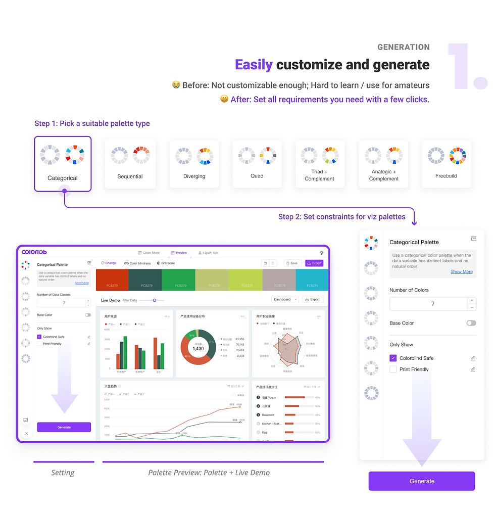
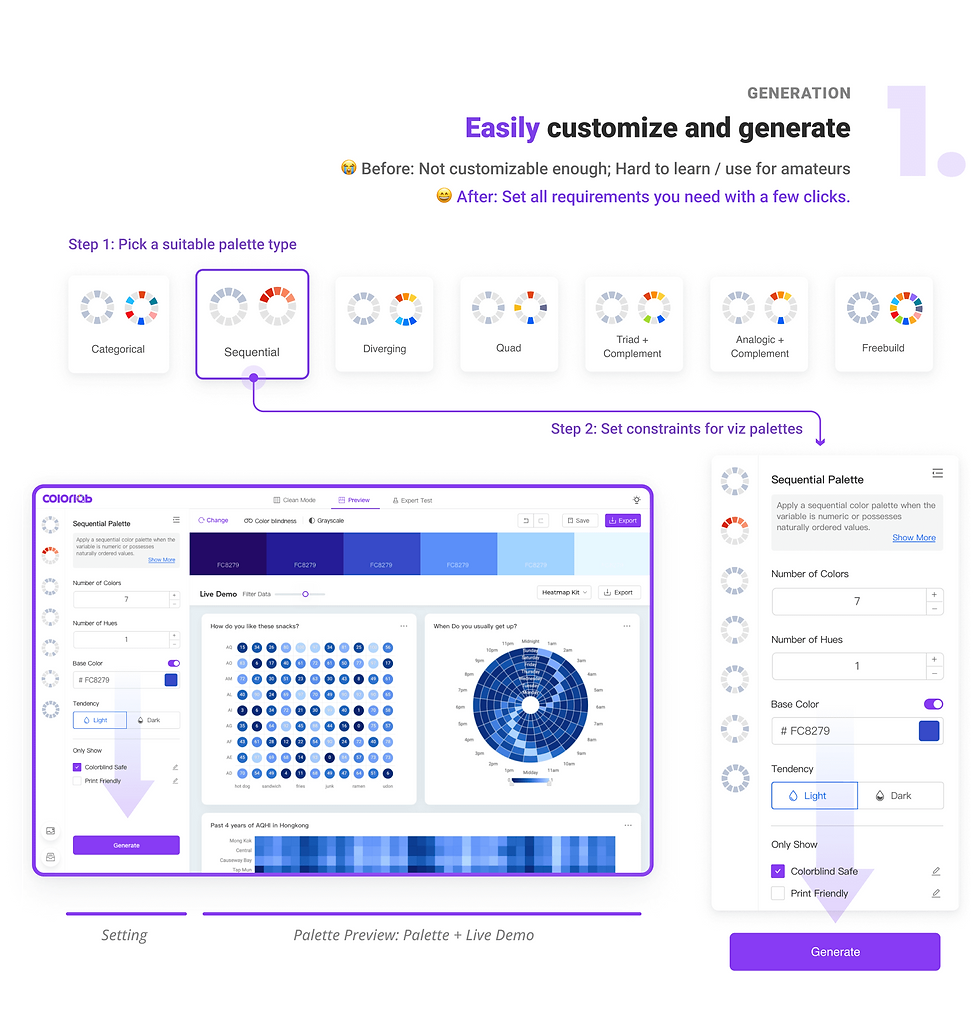
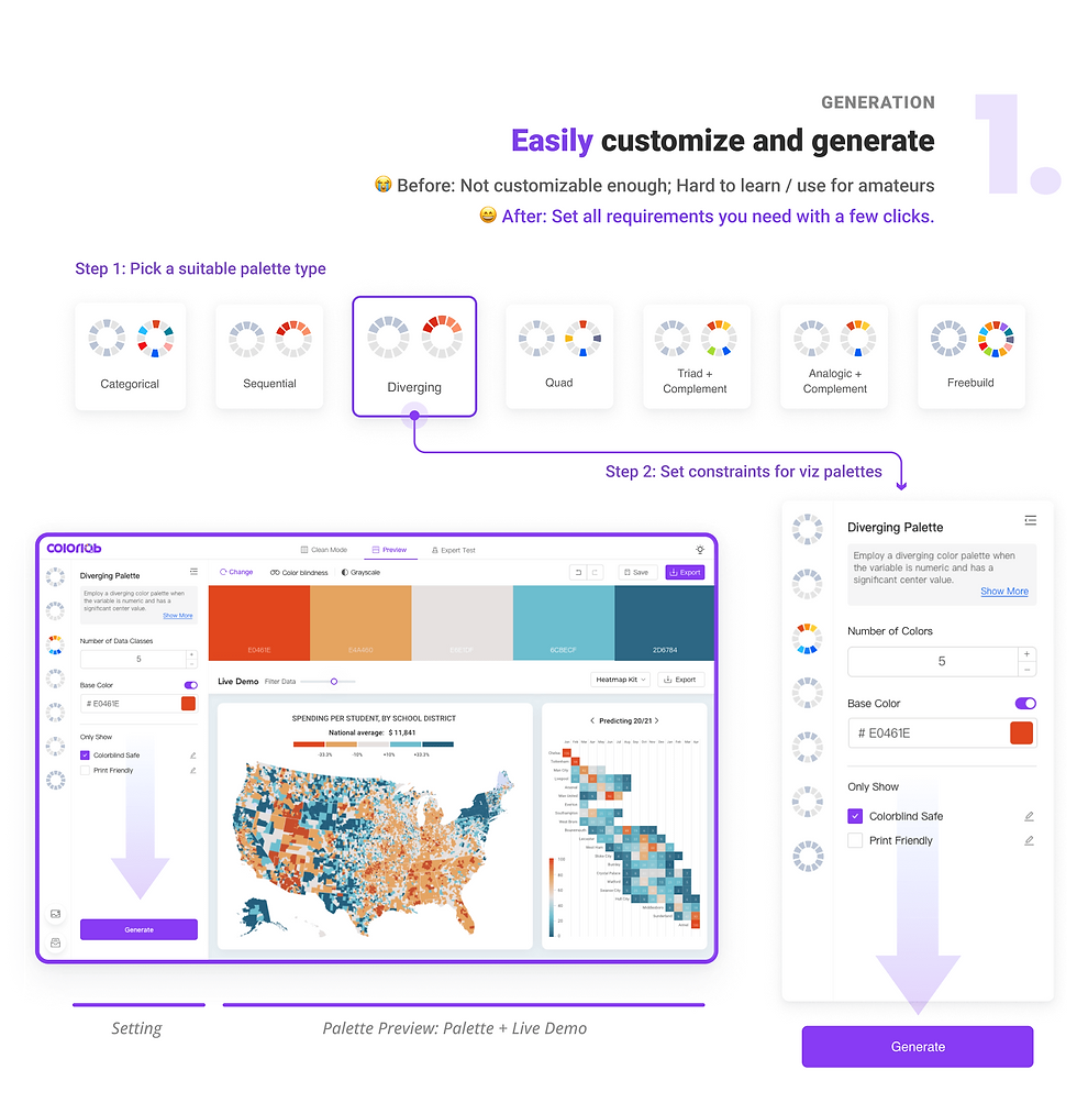
I initiated the ColorLab project. I designed and collaborated with a developer to launch an end-to-end palette creation tool that helps employees with varied expertise in viz design to create satisfying palettes in an efficient, smart, and smooth way. It has the following key features:
1. Streamlining the end-to-end design process from palette requirement setting, generation, usability tests, till application
2. Coupling palettes with intuitive and customizable data viz live demos for users to simulate real applications
3. Providing professional yet amateur-friendly palette usability tests with smart fixes to help users with different visual perceptual abilities to adjust colors efficiently with confidence

OUTCOME
We launched ColorLab and I gave a presentation!
-
Launched Colorlab in Ant Group, Alibaba. Attracted 300+ users after the first launch, who provided very positive feedback.
-
Gave a talk on "How to make a beautiful&effective visualization palette for your report" and promoted ColorLab, attracted 200+ audiences in total at Ant Group, Alibaba. 👉 Slides (in Chinese)


Process
01
Research
Desktop Research
Competitive Analysis
User Interviews
02
Analysis
Qualitative Coding
Persona
Job to Be Done
Key Insights
03
Design
Design Principles
User Flow
Function Structure
Wireframes
Hi-fi Prototype
04
Evaluation
Expert Feedback
MVP Development
Usability Testing
Design Iterations
RESEARCH
Desktop Research: What makes data viz palettes special?
Starting with the question that why users don't directly use common color palettes online for their data visualizations and what are special requirements for data viz palettes, I conducted desktop research on the requirements for visualization palettes. To sum up, professional visualization palettes have high requirements for accessibility, scalability, discernibility, etc., in addition to aesthetic quality.
%20(1).jpg)
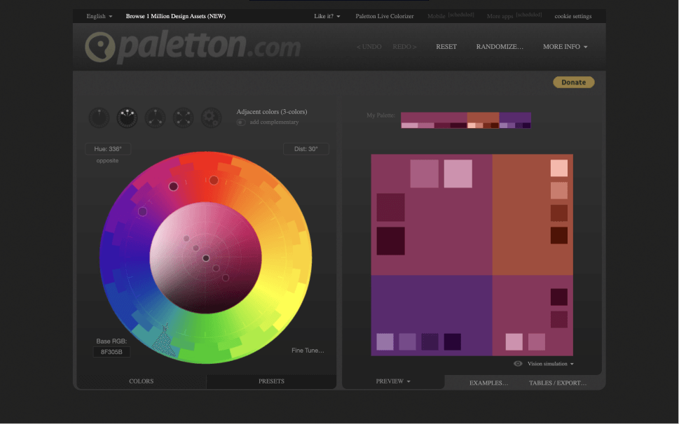
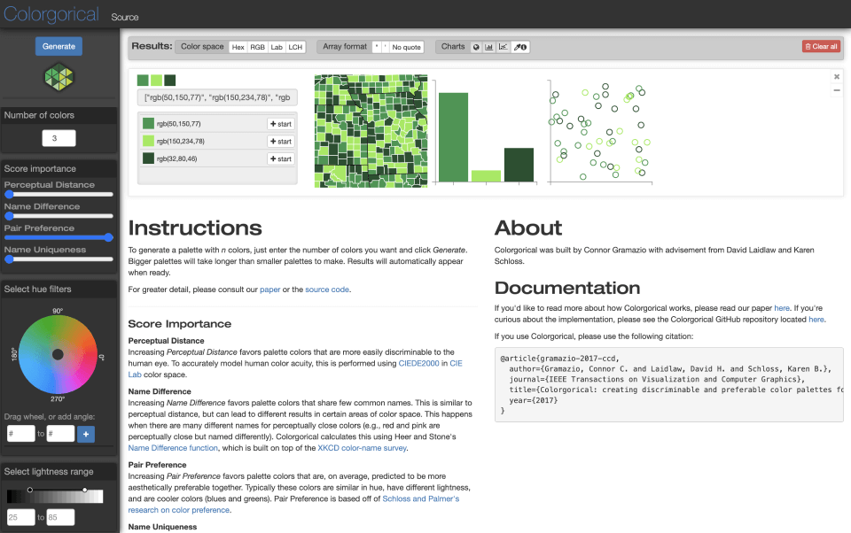
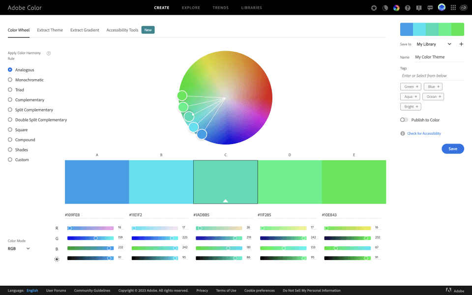
Limitation of Online Palettes
However, most online palettes or automatically-generated palettes, do not satisfy such multifaceted requirements. Many of them are either not accessible (e.g., distinguishable), or do not meet user customization requirements (e.g., include specific brand colors).
Thus, customizing the viz palette "case-by-case" is a common practice yet also a headache.
Competitive Analysis
- Limited examination methods - Manual trials-and-errors in fixing
- Cannot test customized palettes - Manual trials-and-errors in fixing
- Not enough types of tests - Manual trials-and-errors in fixing
- Limited examination methods - Manual trials-and-errors in fixing
Since I've learned the limitation of automatic generation, I then conducted competitive analysis of popular generation tools and mainly focused on their testing & fixing features. I collected my colleagues' feedback to get a better understanding of what was currently successful and what failed to meet their expectations.
View Analysis Details
Hide Details
.png)
Limitation of Existing Tools
Palette testing and fixing process is incoherent and time-consuming since:
1. Existing tools either do not have tests or testing features are incomplete.
2. Do not provide quick fixes. Manual fixes involve too many trials and errors.
User Interviews
After learning viz palette requirements and limitations of existing tools, I wanted to gain first-hand information about user needs, behaviors, and pain points in palette design process. Thus, I conducted user interviews on 8 co-workers from diverse backgrounds and collected the key user quotes to gain insights that inform my design decisions.
View Interview Details
Hide Interview Details
2
Expert Viz Designers Designing Visualizations
2
Visual Designers Designing Visualizations
2
UX Designers Designing Visual Analytics Tools
2
BIs Creating Reports and Dashboards
-
When and for what do you need a new visualization palette?
-
What are your requirements for visualization palettes?
-
How do you usually design a new visualization palette?
-
What are the tools you use? How do you like them?
-
What is the most difficult part in your previous design process? Why is it the most difficult part?
-
Tell me about a time that you overcome that challenge.

ANALYSIS
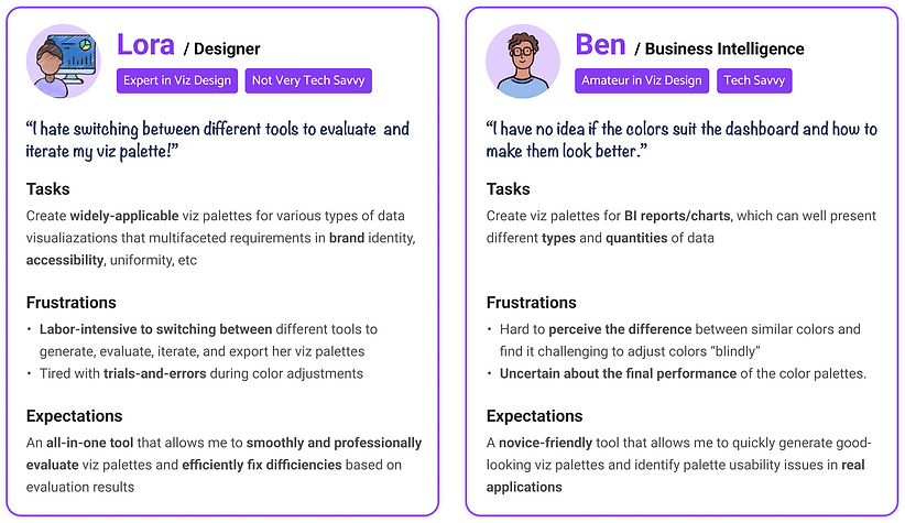
Persona
After learning the viz palette design requirements and limitations of existing methods, I wanted to better understand my target users, their behaviors, pain points, and expectations. I classified the target users at Alibaba into 2 types based on their expertise and needs: One is designers with expert data visualization knowledge, and the other one is BI or general UX/visual designer, who have limited knowledge about data visualizations. My design need to cater to both expert and non-expert users at Ant Group since they both needed to create visualization palettes in their work.
%20(1).png)
Jobs to be done (JBCD)
After several rounds of interviews, I started to analyze my target users using JBCD, so that I could break the big task "to create a useful color palette" into small subtasks and dig deeper into their functional and emotional needs in each task.
JBCD: A similar method as user journey map, but it focuses more on the tasks users need to do, what's the subtask for each task, and also criteria to evaluate each function and user's emotions.
%20(1).jpg)
Key Findings
Users jump back and forth between different stages and tasks, which is frustrating and inefficient. I identified three key pain points behind:

Incoherent and incomplete features of existing tools
Existing tools lack desired functions for generation, testing, and fixing, so users need to switch between different platforms to complete the design process.

Huge gap between design and application
Existing tools only show the palette itself. Users find it hard to imagine how the palette looks like in real applications and thus feel uncertain about their actual usability.

Uncertainty in “perceptual evaluation”
Existing tools heavily rely on users’ color perception to fix deficiencies. Users with poor color perception can only “blindly” adjust the colors and even designers feel unconfident in this process.
Refined Design Goal
Facilitate data viz palette design for both amateur and expert users by reducing the frictions in the design process.
IDEATION
Design Principles
From the insights summarized from JBCD, I decided to design a novel viz palette creation web tool. To better inform my design ideas, I summarized the general design principles based on previous research:
%20(1).jpg)
User Flow & Function Structure
I break down the user flow into 5 stages, and created the function structure based on user requirements. I closely collaborated with developers to prioritize different features and define our minimum viable product.

ITERATIONS
Wireframes
I explored three different layouts to see which one is the most guided, user-friendly one for my target users.
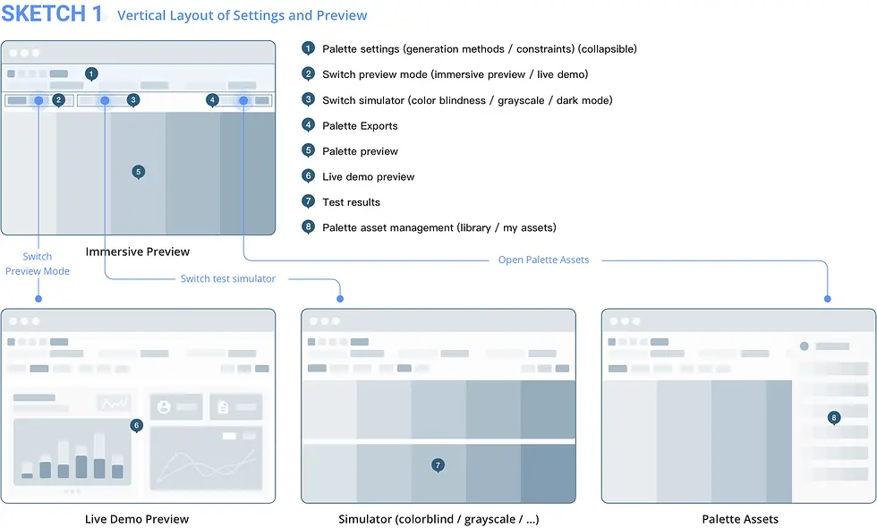
In Sketch1, the setting panel is on the top, and the preview panel is below.
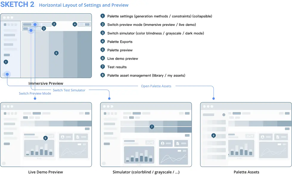
In Sketch2, the setting panel is on the left, and the preview panel is on the right.
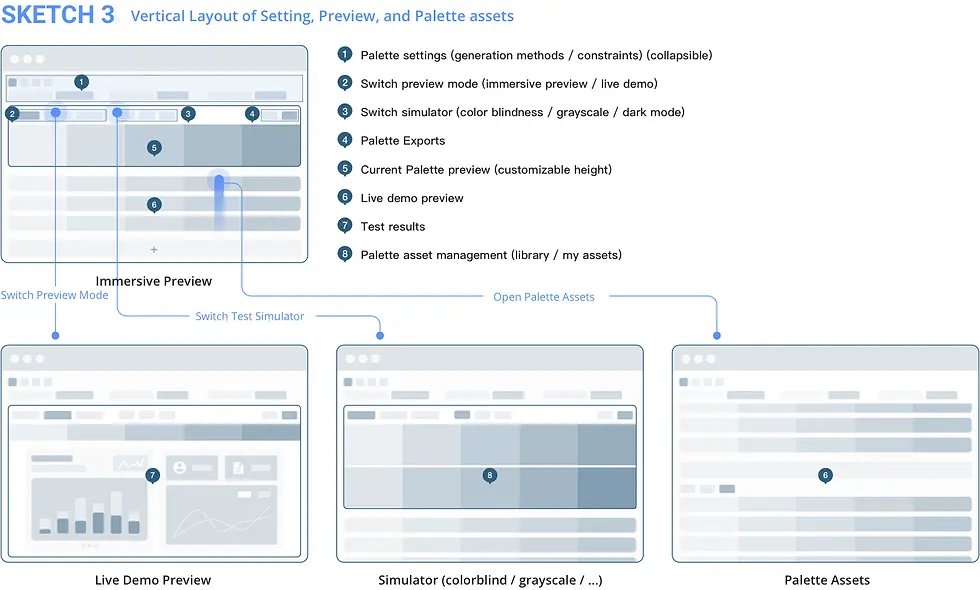
In Sketch3, the setting panel is on the top, below which is the preview of current palette. Saved palette assets are listed vertically below the preview pane.
In Sketch1, the setting panel is on the top, and the preview panel is below.
Mid-fi Prototypes
To quickly test these layouts, I then created mid-fi prototypes and collected feedback from both target users and experienced designers to make my design decision.
.png)
.png)
.png)
Idea Comparison
Based on the feedback from users and expert designers, I decided to go ahead with the second idea.
%20(1).jpg)
Design Critique & Iterations
.png)
Through discussions with expert designers, developers, and quick tests with end-users, I iterated my design for 3 rounds.
FINAL DESIGN
Low-Fi
I came up with 3 possible layouts to compare their pros and cons.
In Sketch1, the preview pane is below the setting pane.


%20(1).png)
DESIGN HIGHLIGHTS
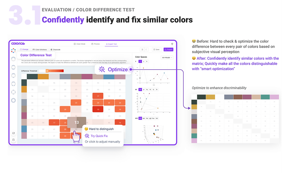
Accessibility Evaluation
Question1: Can we quantify perceived difference of colors?
It’s important to create discriminable color palettes for data visualizations. However, when there are more than 6 colors, even people with good color perception would find it challenging to make all pairs of colors discriminable. Through theory investigation, I learned that Euclidean distance within CIELAB Color Space (a perceptually uniform color space) can be used to measure the perceived difference of colors.

Question2: What’s the average discriminable color distance (ΔE)?
In an experiment conducted in Alibaba in 2019, where participants were asked to choose a color equal or close to the reference one. The 1200 samples collected showed a normal distribution.

Iteration1: Auto Discriminability Optimization
Based on the findings, I came up the idea of an optimization method to fix discriminability issues automatically, and collaborated with an algorithm developer to realize this idea. 👉 View Demo
The blocks highlighted in red are below the threshold of color difference set in the slider and the corresponding two colors are not easily distinguishable.
%20(1).jpg)
Usability Testing
To evaluate the effectiveness of our optimization method, I asked 4 lead users of ColorLab, including 2 amateurs (A1, A2) and 2 experts (E2, E2) in viz design to use it to optimize their color palettes. Then I conducted interviews to collect their feedback.

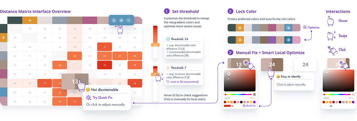
Iteration2: Engage users to enhance color discriminability
Based on user feedback, I designed an interactive color difference matrix that quantify the perceived difference while granting users with enough control in adjustments.
Logo Design

Product Launch & Presentation
After the development, I gave a talk on "How to make a beautiful&useful visualization palette for your report" to employees at Ant Group and promoted ColorLab. Attracted 200+ users who provided very positive feedback!
REFLECTIONS
🧣 Inclusive design: Everyone can be disabled
Our perceptual abilities vary among individuals, with some being able to distinguish colors more easily than others. As designers, it is our responsibility to adopt an inclusive design process that recognizes and considers the needs of excluded communities from the early stages of design. With a firm belief that everyone should have equal and convenient access to perceiving the world, I aspire to use my design skills to enhance people's abilities and bridge the gap created by innate differences in perceptual abilities.
👒🎓 Design for both amateur and expert users
To effectively design for both amateur and expert users, it's essential to recognize that they possess different levels of mental models and expertise. Conducting user research to understand their shared and unique requirements and pain points is crucial. Familiar design patterns and terminology should be used instead of unfamiliar user interfaces or technical terms that may be unfamiliar to amateur users. Additionally, using friendly user guides and expressive icons/emojis can improve the learnability of the design.
To cater to both user groups, it's important to strike a balance between automatic suggestions and user customizations. In the design of the Color Difference Testing feature, it's crucial to grant enough flexibility that expert users require while keeping the design simple enough for amateur users to use effectively.
🍻 Learn from non-designers
I closely collaborated with developers in this project throughout the design process, engaging them to propose their suggestions and ideas. Such cross-boundary helps generate exciting ideas like the color difference visualization and optimization. Also, I learned from developers to take the technical costs and feasibility into my design considerations. Moreover, I learned from some experienced product managers of how to use MVPs to quickly test my design and iterate my design based on user feedback.